
布局方式
Android的界面不像Html一样灵活,大致分为以下几种:
- 线性布局(LinearLayout):按照垂直或水平方向布局
- 帧布局(FrameLayout):组件从屏幕左上方开始布局
- 表格布局(TableLayout):按照行列的方式布局
- 相对布局(RelativeLayout):相对于其他组件布局
绝对布局(AbsoluteLayout)(弃用):按照绝对坐标布局- 网格布局(GridLayout):可以设置跨行跨列的布局
- 约束布局(ConstraintLayout):定义视图之间的相对位置和大小关系
线性布局
【LinearLayout】按照垂直或水平方向布局的组件,也是最常用的组件,包括uniapp也是遵循这个布局。这个布局和前端的flex布局很像。
通过"android:orientation"属性设置垂直(vertical)或水平(horizontal)进行布局
<LinearLayout
    android:layout_width="match_parent"
    android:layout_height="match_parent"
    android:orientation="vertical"
    android:gravity="center">
    <TextView
        android:layout_width="100dp"
        android:layout_height="30dp"
        android:background="#09f"
        android:gravity="center"
        android:textColor="@color/white"
        android:text="1" />
    <TextView
        android:layout_width="100dp"
        android:layout_height="30dp"
        android:background="#ccc"
        android:gravity="center"
        android:textColor="@color/white"
        android:text="2" />
    <TextView
        android:layout_width="100dp"
        android:layout_height="30dp"
        android:background="#3df"
        android:gravity="center"
        android:textColor="@color/white"
        android:text="3" />
</LinearLayout>
效果如下:
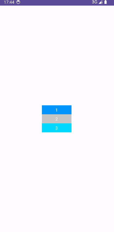
线性布局需要设置layout_width和layout_height:
帧布局
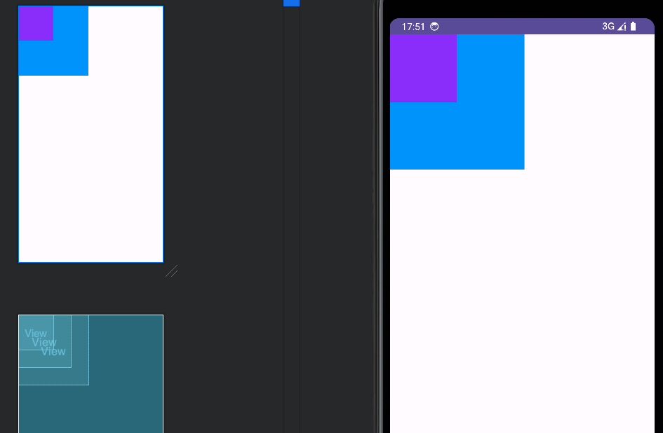
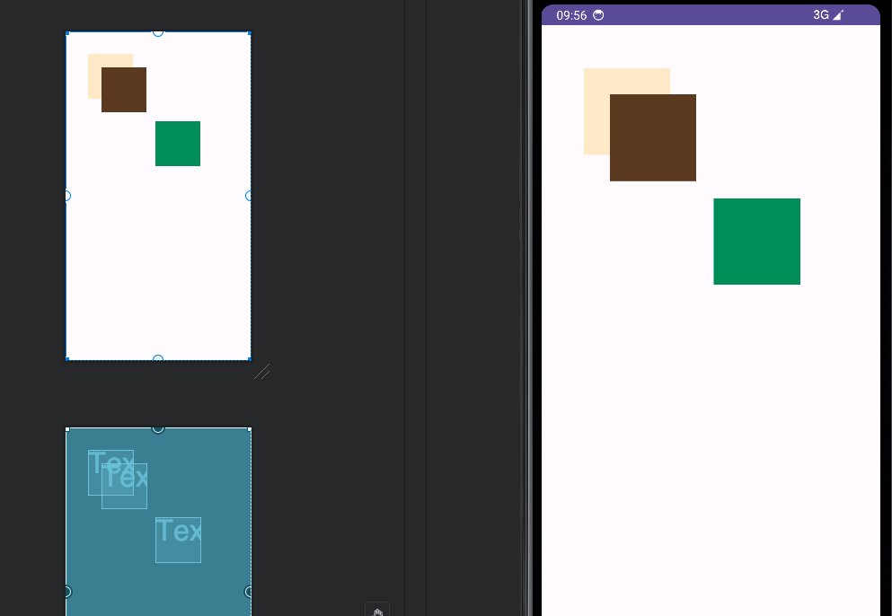
【FrameLayout】【框架布局】最简单的布局方式,在这个布局中的组件都是以层叠的方式显示,通通放置于这块区域的左上角,并且后一个组件会把前面的组件遮挡
<FrameLayout
    android:layout_width="match_parent"
    android:layout_height="match_parent">
    <View
        android:layout_width="150dp"
        android:layout_height="150dp"
        android:background="#000"/>
    <View
        android:layout_width="200dp"
        android:layout_height="200dp"
        android:background="#09f"/>
    <View
        android:layout_width="100dp"
        android:layout_height="100dp"
        android:background="#90f"/>
</FrameLayout>
效果如下:
相对布局
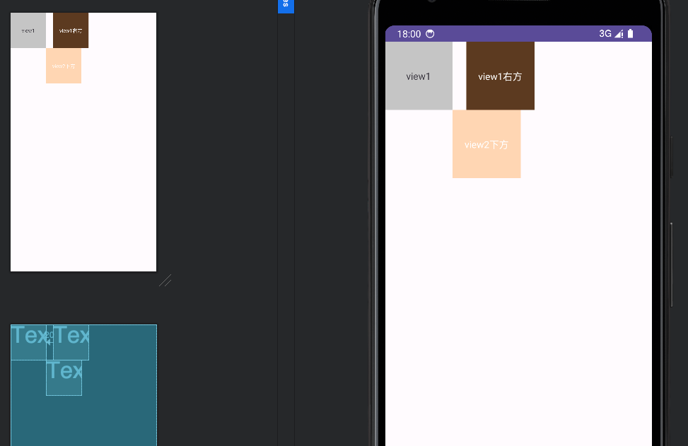
【RelativeLayout】按照各个子元素之间的位置关系完成布局,需要指定位置关系,该布局比较灵活
    <RelativeLayout
        android:layout_width="match_parent"
        android:layout_height="match_parent">
        <TextView
            android:id="@+id/view1"
            android:layout_width="100dp"
            android:layout_height="100dp"
            android:background="#ccc"
            android:gravity="center"
            android:text="view1"/>
        <TextView
            android:id="@+id/view2"
            android:layout_width="100dp"
            android:layout_height="100dp"
            android:layout_toRightOf="@id/view1"
            android:layout_marginLeft="20dp"
            android:background="#ff654321"
            android:textColor="@color/white"
            android:gravity="center"
            android:text="view1右方"/>
        <TextView
            android:id="@+id/view3"
            android:layout_width="100dp"
            android:layout_height="100dp"
            android:layout_toRightOf="@id/view1"
            android:layout_below="@id/view2"
            android:background="#fffedcba"
            android:textColor="@color/white"
            android:gravity="center"
            android:text="view2下方"/>
    </RelativeLayout>
效果如下:
常用的布局属性:
| 属性 | 说明 |
|---|---|
| layout_toLeftOf | 该组件位于引用组件的左方 |
| layout_toRightOf | 该组件位于引用组件的右方 |
| layout_above | 该组件位于引用组件的上方 |
| layout_below | 该组件位于引用组件的下方 |
| layout_alignParentLeft | 该组件是否对齐父组件的左端 |
| layout_alignParentRight | 该组件是否齐其父组件的右端 |
| layout_alignParentTop | 该组件是否对齐父组件的顶部 |
| layout_alignParentBottom | 该组件是否对齐父组件的底部 |
| layout_centerInParent | 该组件是否相对于父组件居中 |
| layout_centerHorizontal | 该组件是否横向居中 |
| layout_centerVertical | 该组件是否垂直居中 |
绝对布局
【AbsoluteLayout】通过设置layout_x和layout_y属性来描述该元素相对于左上角的位置,此布局优点就是布局最灵活,但是最大的缺点也是无法适配各种设备,几乎很少有人用。
    <AbsoluteLayout
        android:layout_width="match_parent"
        android:layout_height="match_parent">
        <TextView
            android:layout_width="100dp"
            android:layout_height="100dp"
            android:layout_x="50dp"
            android:layout_y="50dp"
            android:background="#ffedcb"/>
        <TextView
            android:layout_width="100dp"
            android:layout_height="100dp"
            android:layout_x="80dp"
            android:layout_y="80dp"
            android:background="#654321"/>
        <TextView
            android:layout_width="100dp"
            android:layout_height="100dp"
            android:layout_x="200dp"
            android:layout_y="200dp"
            android:background="#009a61"/>
    </AbsoluteLayout>
效果如下:
表格布局
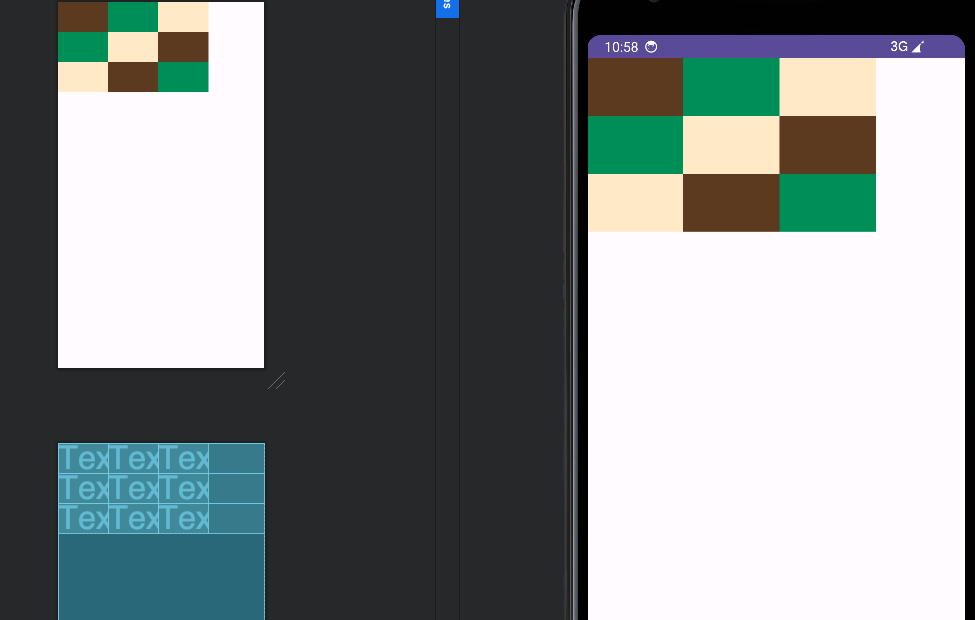
【TableLayout】和表格一样N行N列的布局格式,由多个TableRow组成,但和前端表格不一样的就是,无法跨行跨列。
    <TableLayout
        android:layout_width="match_parent"
        android:layout_height="match_parent">
        <TableRow
            android:layout_width="match_parent"
            android:layout_height="wrap_content">
            <TextView
                android:layout_width="100dp"
                android:layout_height="60dp"
                android:background="#654321"/>
            <!--可以跟随第一个的高度-->
            <TextView
                android:layout_width="100dp"
                android:layout_height="match_parent"
                android:background="#009a61"/>
            <TextView
                android:layout_width="100dp"
                android:layout_height="match_parent"
                android:background="#ffedcb"/>
        </TableRow>
        <TableRow
            android:layout_width="match_parent"
            android:layout_height="wrap_content">
            <TextView
                android:layout_width="100dp"
                android:layout_height="60dp"
                android:background="#009a61"/>
            <TextView
                android:layout_width="100dp"
                android:layout_height="match_parent"
                android:background="#ffedcb"/>
            <TextView
                android:layout_width="100dp"
                android:layout_height="match_parent"
                android:background="#654321"/>
        </TableRow>
        <TableRow
            android:layout_width="match_parent"
            android:layout_height="wrap_content">
            <TextView
                android:layout_width="100dp"
                android:layout_height="60dp"
                android:background="#ffedcb"/>
            <TextView
                android:layout_width="100dp"
                android:layout_height="match_parent"
                android:background="#654321"/>
            <TextView
                android:layout_width="100dp"
                android:layout_height="match_parent"
                android:background="#009a61"/>
        </TableRow>
    </TableLayout>
效果如下:
网格布局
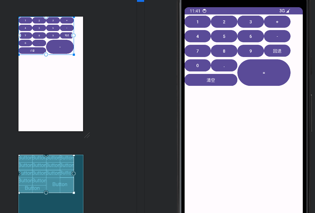
【GridLayout】N行N列的形式,可以设置跨行和跨列
    <GridLayout
        android:layout_width="wrap_content"
        android:layout_height="wrap_content"
        android:orientation="horizontal"
        android:columnCount="4"
        android:rowCount="5"
        tools:ignore="MissingConstraints">
        <Button android:text="1" />
        <Button android:text="2" />
        <Button android:text="3" />
        <Button android:text="+" />
        <Button android:text="4" />
        <Button android:text="5" />
        <Button android:text="6" />
        <Button android:text="-" />
        <Button android:text="7" />
        <Button android:text="8" />
        <Button android:text="9" />
        <Button android:text="回退" />
        <Button android:text="0" />
        <Button android:text="." />
        <Button
            android:layout_rowSpan="2"
            android:layout_columnSpan="2"
            android:layout_gravity="fill"
            android:text="=" />
        <Button
            android:layout_columnSpan="2"
            android:layout_gravity="fill"
            android:text="清空" />
    </GridLayout>
效果如下:
约束布局
【ConstraintLayout】也是最常见的布局容器,主要包括以下特点:
- 相对定位:可以通过约束条件将视图相对于父容器或其他视图进行定位,而不需要使用嵌套布局。
- 连接线:可以通过设置约束条件来调整视图的大小和比例,以适应不同屏幕尺寸和方向的变化。
- 弹性尺寸:可以使用连接线(Guideline)来辅助布局,例如将视图与屏幕的边缘或其他视图的对齐。
- 链式布局:可以使用链式约束来创建视图链,比如水平或垂直的线性链。
功能强大,几乎可以实现所有布局,而且有性能优势,小白才学,还没升入了解,详见这篇文章
常用属性
| 属性 | 用法 | 说明 |
|---|---|---|
| id | @id/xxx | 元素ID |
| layout_width | 见下方 | 布局宽度 |
| layout_height | 见下方 | 布局高度 |
| gravity | 见下方 | 内部元素的对齐方式 |
| layout_gravity | 见下方 | 元素在父容器中的对齐方式 |
| orietation | vertical垂直、horizontal水平 | 方向 |
| background | 颜色、图片、选择器 | 可绘制背景 |
| backgroundTint | 颜色 | 背景色 |
| weight | 类似前端flex属性 | 比重 |
| padding | 可以独立设置四边,如:paddingLeft | 内边距 |
| margin | 可以独立设置四边,如:marginLeft | 外边距 |
布局宽高:
| 属性值 | 说明 |
|---|---|
| match_parent | 也叫 |
| wrap_content | 可以理解为跟随里面内容的大小 |
layout_gravity/gravity属性:
| 属性值 | 说明 |
|---|---|
| top | 顶部对齐 |
| bottom | 底部对齐 |
| left | 左对齐 |
| right | 右对齐 |
| center | 水平垂直居中 |
| center_vertical | 垂直居中 |
| center_horizontal | 水平居中 |
| fill_vertical | 垂直填充 |
| fill_horizontal | 水平填充 |
Comments NOTHING