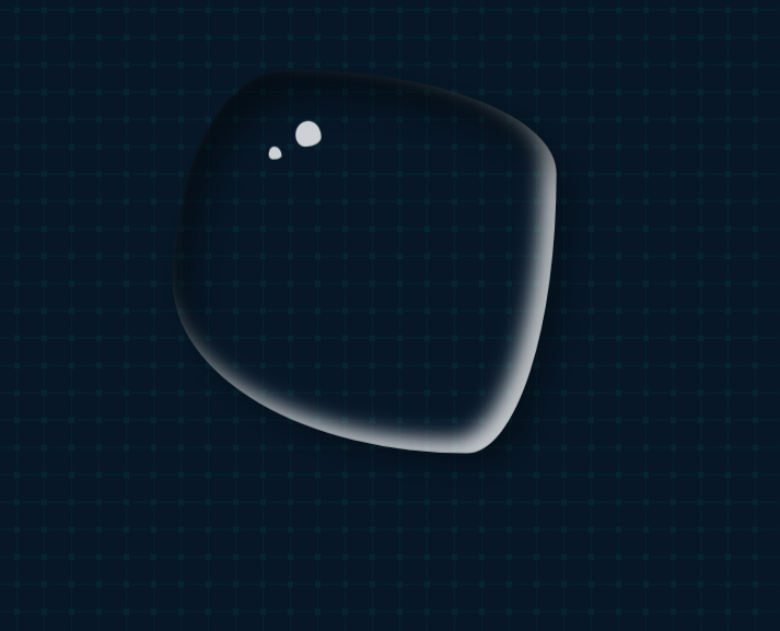
.water {
    width: 300px;
    margin-top: 100px;
    height: 300px;
    border-radius: 59% 41% 63% 37% / 22% 26% 74% 78%;
    box-shadow: inset 10px 20px 30px rgba(0, 0, 0, 0.5), 10px 10px 20px rgba(0, 0, 0, 0.3),
        15px 15px 30px rgba(0, 0, 0, 0.05), inset -10px -10px 15px rgba(255, 255, 255, 0.8);
    position: relative;
    animation: hd 3s linear infinite alternate;
}
.water::after {
    content: '';
    width: 20px;
    height: 20px;
    position: absolute;
    top: 40px;
    left: 32%;
    background-color: rgba(255, 255, 255, 0.8);
    border-radius: 50% 50% 63% 37% / 54% 63% 37% 46%;
}
.water::before {
    content: '';
    width: 10px;
    height: 10px;
    position: absolute;
    top: 60px;
    left: 25%;
    background-color: rgba(255, 255, 255, 0.8);
    border-radius: 42% 58% 63% 37% / 63% 71% 29% 37%;
}
@keyframes hd {
    25% {
        border-radius: 30% 70% 44% 56% /42% 26% 74% 58%;
    }
    50% {
        border-radius: 30% 70% 21% 79% /57% 26% 74% 43%;
    }
    100% {
        border-radius: 30% 70% 51% 49% /33% 40% 60% 67%;
    }
}
Comments NOTHING